Reflection
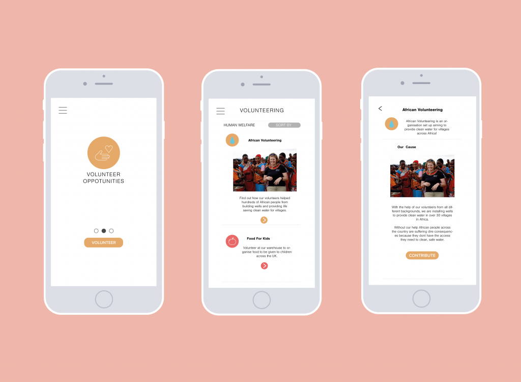
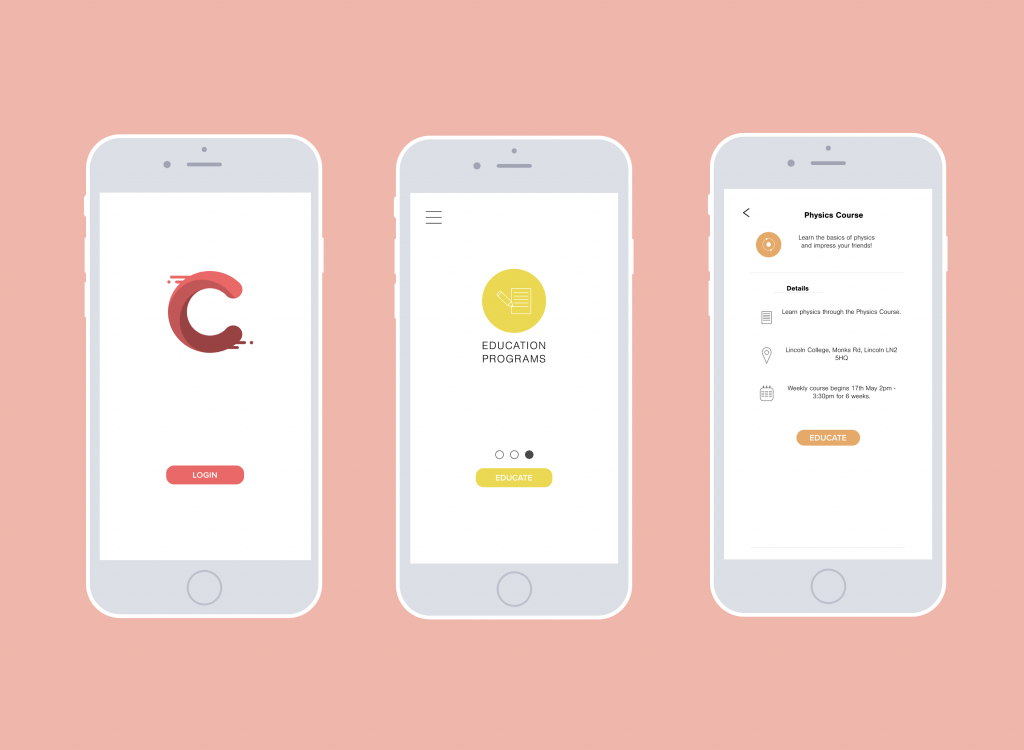
Overall, I think this project was an interesting learning experience. It developed my knowledge further in various aspects of technicality within the Adobe Creative Cloud. Using Adobe Illustrator was one of my favourite aspects to this project, because I am the most comfortable with that program out of all the Adobe programs. I enjoyed designing and creating each asset to be placed onto each screen. However, one aspect to the project that I found quite tedious as time past was creating the 94 individual screens for the Adobe XD project. Through the development stage I did not realise how many I was making, I just aimed to make an appropriate amount for each area of the app. When I had to import each screen individually and organise the Adobe XD, it became an especially tedious task because of the sheer content I produced.
Adobe XD was particularly the biggest learning curve that I had to undergo during the development process. This was because I had little experience with it prior to to this project. I enjoyed creating the final product that was the Adobe XD file itself and it was very rewarding to essentially have a working prototype of my app, Contribute that I could then submit but also show people the work that I’m producing. If I ever decided to revisit the project and develop it even further like code it or try to publish, I have left myself on a very good starting point.
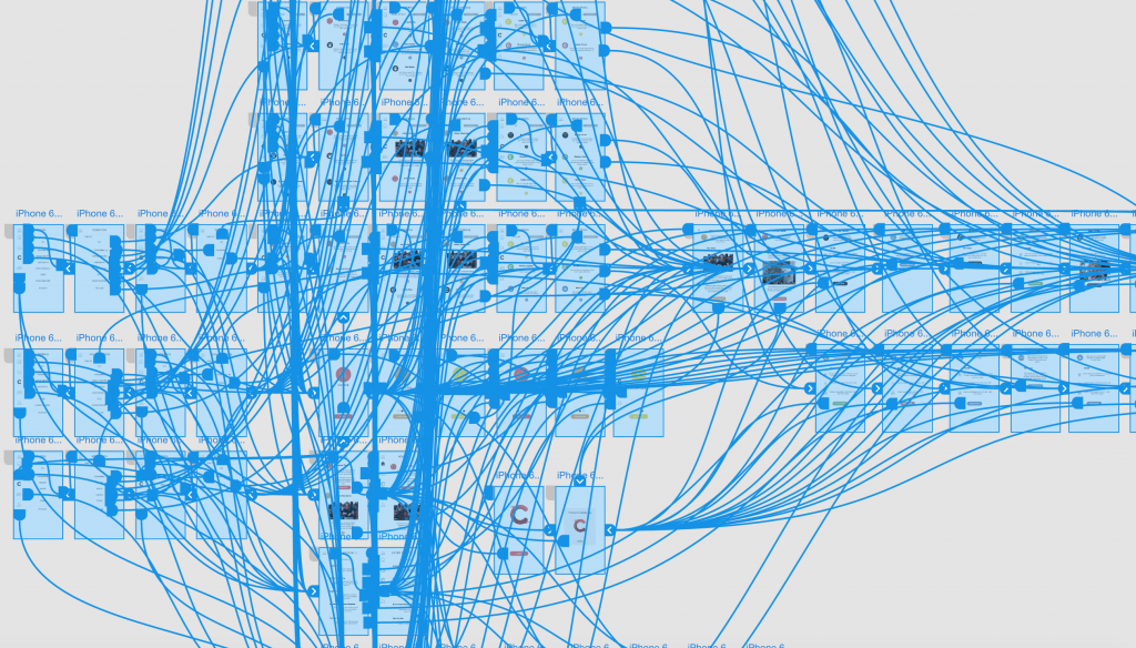
One problem that I encountered when making the Adobe XD project was making sure every single button I had made interactive was correct. This was a mammoth task in ensuring that a button would send the user to the correct screen and that the correct transition was used. I found that the best way to overcome this was to highlight the screen to see each interaction was connected to the right screen, seen previously in the aforementioned screenshot on development.
If I was to do this project again, I would have perhaps thought more about adding buttons or screens to show interactivity from user-user or a ‘following’ system where users can follow organisations. Furthermore, I would have liked to add a ‘settings’ button to the app in perhaps the profile screen, as well as enable the user to change their icon to make the project even more immersive.
Evaluation
I think my project had a lot of strong areas but some elements needed definite improvements.
Throughout the course of development, I thought the planning in my sketch book was a fantastic detailed way to keep organised and I would have struggled to produce my work without it. Due to my organisation skills in the planning stage in benefitted me throughout the rest of the project, in all aspects.
Furthermore, I thought my asset creations and the contents that I produced for my screens was strong, they all had a clear connection to each other which created one holistic product when pieced together.
One area of the project that I could have improved upon was the use of more copyright free images. All the images used in the project were sourced from Creative Commons so that they were royalty free. I think maybe allowing users to upload images of their contributions would be a good form of gamifiaiton and make the app more immersive and personalised to each user for an improved experience.
Overall, I think my project meets the criteria of the brief given to us, because the whole idea came from researching the European Youth Awards, and choosing the category ‘Active Citizenship’ which was stated in the brief. My idea for ‘Contribute’ is original as I just wanted to create an app that aimed to improve citizenship and community and by having these different elements of services into one holistic concept, it justifies my project and meets the grading criteria because if it was published, it would improve active citizenship by allowing users to contribute to their community in a range of different ways.
Furthermore, my project meets the criteria of the brief because my Adobe XD project is extensive enough that it is a substantial digital media concept that has delved into the details of its realisation.
When my proposal was approved, I researched the relevant market on my blog so that I was making informed decisions on how to develop my concept so that it was an improvement from the products that are available on the market today.
My concept also meets the brief given the quality and creativity of my conceptualisation and realisation is present throughout my project, and the technicalities of creating the project to its level of interactivity.


